| INHORGENTA MUNICH 2023 - Colourful Springtime |
 |
In this Edition:
|
|
|
|
|
Dear Customers, Dear Friends of Our Natural Fancy Coloured Diamonds,
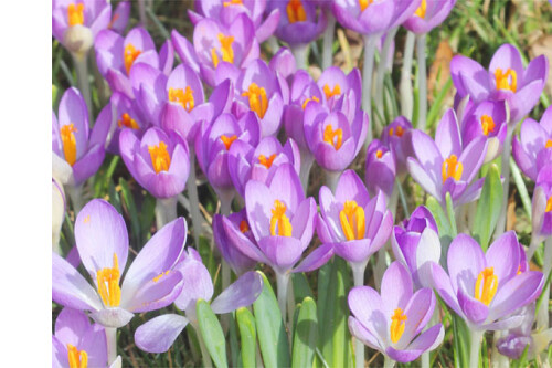
Spring will be here soon!
"It is beneficial to surround oneself with coloured things. What pleases the eye refreshes the mind, and what refreshes the mind refreshes the body."
Prentice Mulford (1834 - 1891), American Journalist, Educator, Gold Miner and Department Store Owner. |
 |
Our two partner companies, Dominik Kulsen AG in Switzerland and Kulsen & Hennig GbR in Berlin, have chosen to highlight fresh, warm, spring colours for 2023. The colours of spring are soft and light and radiate cheerfulness and vitality.
Spring green, fresh yellow, delicate pink, and sunny, yellow-orange are our favourites this year.
We wish you a wonderful start to the sunny, spring season and, as always, much pleasure reading!
Your Kulsen & Hennig GbR and Dominik Kulsen AG Teams,
Juliane Hennig
|
|
Of course, we will be there again!
|
 |
We look forward to meeting you in person, as our customers and our friends, and to showing you our treasures!
You will find us in Hall C1, Stand 309.
"I collect delicate colours
and paint them on a sheet of paper.
And if the world seems grey and empty,
then I give my colours here."
- Unknown |
 |
We encounter colours every day, but how often do we stop to consider their meaning and how they influence us?
Whether it's through the calming effect of a blue sky, the inspiring view of a colourful spring meadow, or even the bright colours in a restaurant's logo that make our mouths water, each colour impacts us differently and appeals to various emotions. People decide in a few seconds if they like something or not (a product, for example), and 90% of their decision is based solely on colours.
Colour theory is a real science. Understanding the meaning of colours can help us choose them better and learn to harness the power of colour psychology.
In the field of Natural Fancy Coloured Diamonds, as in the field of gemstones in general, we inevitably encounter the theme of colour. Because every colour possesses a different radiance and overall effect, goldsmiths and jewellery designers have ample opportunity to express themselves artistically and find just the right combination of colour and shape for any jewellery wearer.
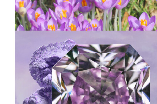
The Digital Lavender Colour Trend: Peace and Serenity in 2023
For the year 2023, colour experts from WGSN, the international trend research company, and from the Coloro colour system company all predict that Digital Lavender will be this year’s new colour trend.
The light violet shade communicates two emotional worlds and brings them into harmony with each other: peace and serenity. The colour appeals to both design experts and consumers by visually expressing two very opposite sensations. Dark purple appears extravagant and original, whereas light purple appears soft and serene.
|
 |
As mentioned above, research indicates that Digital Lavender evokes a feeling of peace and serenity when viewed. These colour sensations are created by the respective wavelengths of the hues. Colours with longer wavelengths, like the colour red, have a stimulating and activating effect on the mood. Calm colours, such as blue or turquoise, on the other hand, appear more balanced thanks to short wavelengths. In terms of colour psychology, then, the trend development of Digital Lavender should not come as a surprise.
The cheerful, and at the same time relaxing, almost healing, shade ties in with two other current trending colours, natural yellow and earthy tones, which have an equally soothing and brightly friendly effect. People want stability and positivity - especially after the past months. And best of all, calm colours can be excellently combined with other colour nuances, so there is no limit to creative possibilities.
Our collection features some beautiful pieces in today’s trending springtime colours:
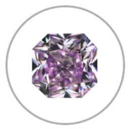 |
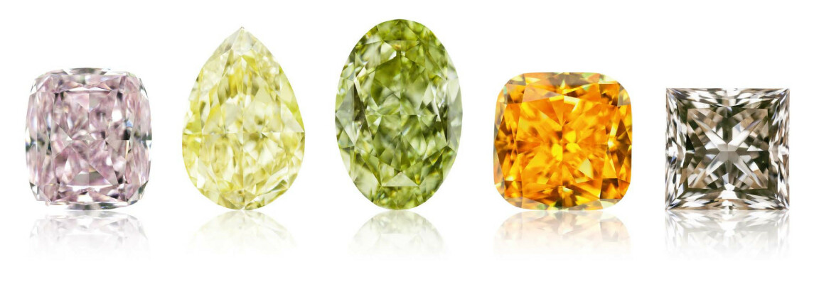
Lavender: Peace, serenity, and cheerfulness
Radiant / GIA 2175699153 / Fancy Pink Purple / 0.52 ct / VS2 /
4.37 x 4.34 x 3.20 mm |
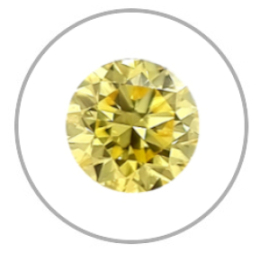 |
Yellow: Cheerfulness, hope, and spontaneity
The colour yellow is a real classic and always in fashion; the colour of the sun, smileys, and sunflowers, it is a cheerful colour that is full of hope and positivity.
Round Brilliant / GIA 2215267145 / Fancy Intense Yellow /
0.53 ct / VS2 / 5.05 - 5.08 x 3.26 mm |
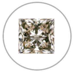 |
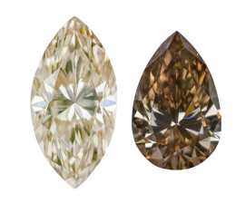
Earthy Colours: Noble and warm
Princess / Medium Champagne C3 / 1.06 ct / VVS / 5.49 x 5.45 x 4.08 mm
Possible colour combinations:
Champagne and Olive Green: These complementary colours enhance each other's effect
Tone on tone: Harmonious harmony
Champagne and Gray: The stone colour brings an elegant, contemporary touch to the warmer, earthy tone |
|
|
Johannes Itten and Colour
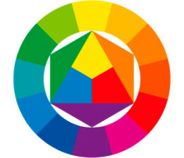 |
Johannes Itten, born in Switzerland in 1888, was one of the most important artists of the twentieth century. Throughout his teaching career at art schools and colleges, he developed colour theories, which he published in 1961 with his book "The Art of Colour" and thus made his teachings accessible to all. Itten was particularly interested in the interaction of colours and the resulting colour contrasts. His basic idea was that all bright colours can be mixed together from only three main colours, the primary colours of red, yellow and blue. |
The colour wheel shown consists of the three primary colours already mentioned (red, yellow and blue). If these are mixed, three secondary colours are produced: green, orange and purple. If these three newly created secondary colours are mixed with the primary colours, six more colours, called the tertiary colours, are created. For example, when red, a primary colour, is mixed with orange, a secondary colour of red and yellow, the result is the tertiary colour red orange.
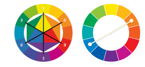
The different colour contrasts Itten evokes within his colour theory can be implemented not only in art, but also in jewellery design. The diamond, for example, is a precious stone with a very broad colour spectrum. By applying Itten’s theory, it is possible to highlight different stones by emphasizing their colours and creating either a contrasting or an even, harmonious, colour impression.
For example, a different colour impression will be created by choosing colours that are opposite each other on the colour wheel, called complementary colours, rather than choosing colours that are next to each other on the colour wheel, known as analogue colours.
Some Examples of Itten's Colour Contrasts:
Complementary Contrast:
If you select two colours that are exactly opposite each other on the colour circle (complementary colours) and place them next to each other, the luminosity of both colours will increase.
|
 |
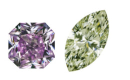 |
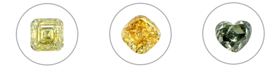
Example of a complementary contrast with the trending colour Digital Lavender combined with a delicate green:
Fancy Intense Purple & Fancy Grayish Green.
|
Quantity Contrast: This is created by juxtaposing colour surfaces with different colour areas of different sizes. For example, a piece of jewellery with a large pavé setting of yellow diamonds and a small blue diamond in the centre will have a different effect than the other way around.
 |
Light-dark Contrast: Thanks to the contrast created by positioning a light surface next to a dark one, each colour intensifies the other.
Example: Light brown (C2) & dark brown (C6) - both colour tones are beautifully enhanced by the contrast.
|
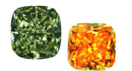 |
Cold-warm contrast: People perceive red, yellow, or orange tones as warm and blue-green tones as cold. This cold-warm sensation is often used in art to represent contrasts. Here, too, the colours intensify each other.
Example: Fancy Dark Green & Fancy Vivid Yellow Orange
|
At Inhorgenta, dear customers, you will have the opportunity to try out a wide variety of colours directly on site, to see the effects of different stones when positioned side by side, and to try out various combinations.
Come and see us - we are ready and equipped for all your colour adventures!
Hall C1 / Stand 309
|
|
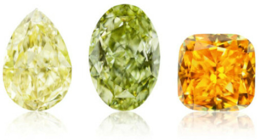
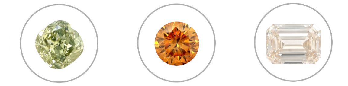
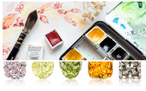
Square Step Cut / GIA 7443085252
Fancy Deep Greenish Yellow / 2.10 ct / VS1 / 6.61 x 6.56 x 4.98 mm
Cushion / GIA 5212440580
Fancy Deep Orangy Yellow / 1.01 ct / VS1 / 5.60 x 5.56 x 3.72 mm
Heart Shape / GIA 6435257429 / Chameleon
Fancy Dark Gray Yellowish Green / 0.51 ct / VS2 / 5.39 x 4.72 x 2.72 mm
Cushion / GIA 7191953271
Fancy Deep Green Yellow / 2.00 ct / SI1 / 6.98 x 6.96 x 4.50 mm
Round Brilliant / GIA 6224653455
Fancy Deep Yellow Orange / 1.02 ct / PQ1 / 6.17 - 6.24 x 4.04 mm
Emerald Cut
Top Light Brown / 5.01 ct / VVS / 10.60 x 8.00 x 5.92 mm
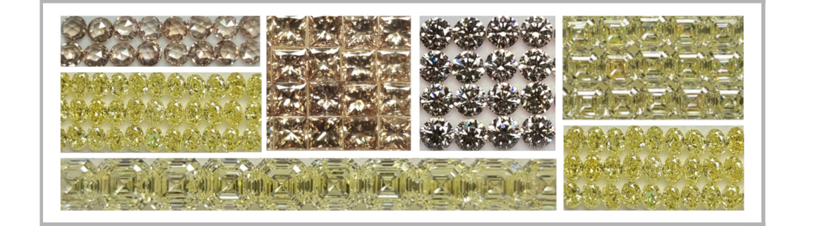
You can also discover our many different, perfectly matched, rows of diamonds, suitable for eternity rings and tennis bracelets. All to be found in our treasure trove at Inhorgenta 2023!
Rose Cut / Medium Champagne / SI-VVS / 3.80 - 3.90 mm
Princess / Medium Champagne / SI-VVS / 3.50 - 3.60 mm
Round Brilliant / Light Champagne / SI-VVS / 4.10 - 4.20 mm
Asscher Cut / Fancy Light Yellow / SI-VVS / 3.00 - 3.05 mm
Asscher Cut / Fancy Yellow / SI-VVS / 4.00 - 4.05 mm
Oval / Fancy Intense Yellow / SI-VVS / 3.90 x 2.75 mm
|
|
|